See exactly where users experience friction, confusion or delight.
Use it to answer:
✔ “Which pages are causing the most issues?”
✔ “Did our redesign reduce friction?”
✔ “Where should we focus our next round of improvements?”


Every team collects feedback, but very few teams truly understand it.
Bug reports, emails, user comments, session replays, integrations… the data pours in from everywhere, yet the most important questions remain unanswered:
That’s exactly why we built Userback Reports, a single, powerful place to measure user feedback, spot trends instantly, and help your team make smarter decisions with less effort.
Teams today are overwhelmed with feedback, but starved for clarity.
✗ User research tools give analytics.
✗ Ticketing tools give lists.
✗ Feedback tools give raw comments and screenshots.
But none of them give a complete picture of what’s happening across your product.
The result? Teams waste hours piecing data together, manually checking priorities, and guessing which issues matter most.
Userback Reports solves this by centralizing every feedback into one real-time dashboard – sentiment, sources, types, resolution speed, and trends over time.
Now your product, engineering, support, and QA teams can see exactly what’s happening, make decisions faster, and close the loop confidently.
All your feedback insights in one place. Smarter, faster decisions.
Start conducting product surveys right away, with a quick and easy set-up.
You don’t need to be a data analyst to understand Userback Reports. Everything your team needs is organised into a simple, clear dashboard, without burying you in data and focuses on the four core areas you need to track product health.
See how users feel about your product in real time. This helps you instantly spot shifts in satisfaction before they become larger problems.
Real World Applications:
a. A drop in sentiment may point to:
b. This makes it easy to answer questions like:

Understand what users are saying, and what type of feedback is increasing. Whether you’re monitoring bug trends or feature requests, these charts tell you exactly where attention is needed.
Real World Applications:
a. Identify the highest impact issues by sorting feedback by
b. This makes it easy to answer questions like:
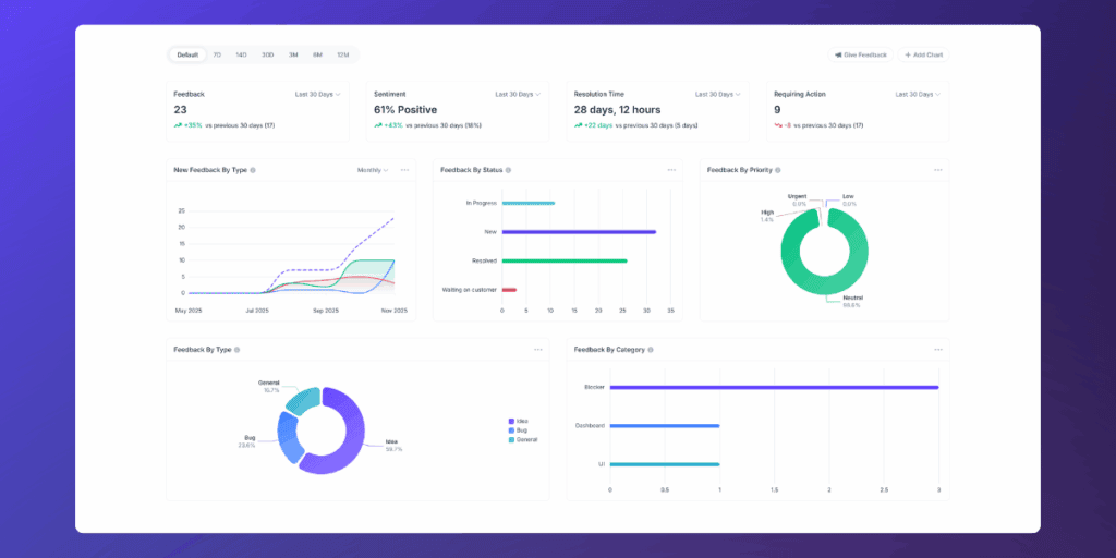
See where feedback comes from and which users or environments are impacted.
Real World Applications:
a. Browser and platform insights show you whether issues are isolated or systemic, for example, Safari users may report more UI problems which will require specific rending issues.
b. This makes it easy to answer questions like:

Measure how efficiently your team handles feedback and closes the loop. Perfect for sprint retros, resourcing decisions, and improving your QA or support workflow.
Real World Applications:
a. See how long issues take to resolve and which stages slow down the process, which is especially useful for:
b. This makes it easy to answer questions like:

Each insight is linked to real user feedback, screenshots, replays, and context, so you don’t just see the numbers, you can act on them instantly. Align your team around one source of truth and replace internal debates with clear, evidence-based decisions.
Getting up and running takes seconds.

Reports are available on all plans, so your entire team can start using it today.
Please Note: Client Roles do not have access to Reports
If you’re just getting started with Userback Reports, these three charts will give you the clearest picture of what’s happening across your product, and where to focus next.
See exactly where users experience friction, confusion or delight.
Use it to answer:
✔ “Which pages are causing the most issues?”
✔ “Did our redesign reduce friction?”
✔ “Where should we focus our next round of improvements?”
Quickly understand what themes are driving the most feedback, whether it’s UI, performance, integrations, onboarding, or something else.
Use it to answer:
✔ “What problems are trending right now?”
✔ “Which categories need attention this sprint?”
✔ “Are our fixes reducing issues in key areas?”

See whether feedback is coming in as bugs, requests, suggestions, or questions, and how that mix is changing over time.
Use it to answer:
✔ “Are bug reports increasing?”
✔ “Is demand for this feature growing?”
✔ “What types of feedback are spiking this month?”

Together, these reports give you a clear, actionable starting point, showing where problems happen, what they relate to, and what type of feedback is driving the change. Use them to move from assumptions to evidence and guide your next product decisions with confidence.
Other tools either give you analytics without context, or feedback without insight.
Userback bridges both worlds by giving you:
✔ Visual feedback
✔ Session replays
✔ Sentiment
✔ Priorities
✔ Categories
✔ User context
✔ AND reporting
…all in one place.
✗ No spreadsheets.
✗ No switching platforms.
✗ No duct-taped reporting tools.
Just one simple, powerful dashboard built for modern product feedback loops.
Try Userback today and start building with confidence.